My First Stab at Infographics & an Announcement

I’ve been fascinated by infographics and data visualization for a few years now and have started doing some presenting on the topic at conferences. But one of the questions that keeps arising and perhaps the greatest barrier to making stories with numbers and images is, “How do you do the design?” The tech is easy. It’s crafting the story or message that’s hard.

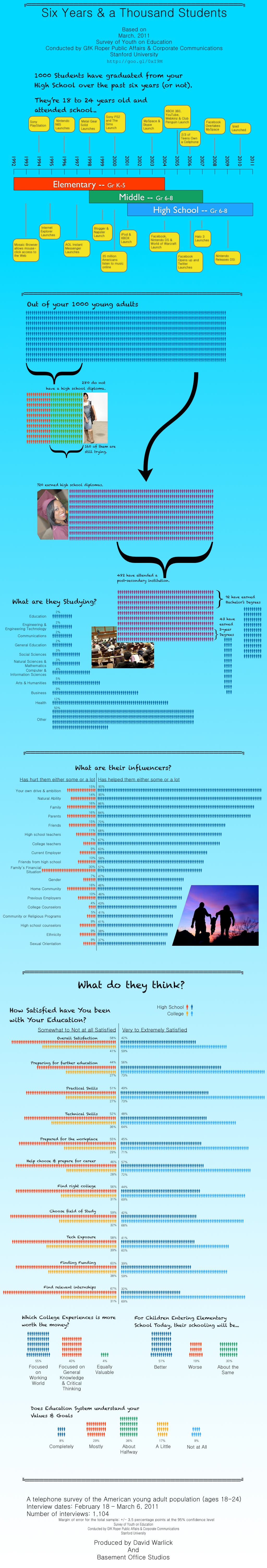
So I decided to try making one myself, hoping that some reasonable process might come out of it. I’m somewhat pleased with the graphic, as a first time effort, but can’t say that I have any handle on a design process. All I can say is that it involves a lot of trashing the whole thing and starting all over again.  I guess its about a willingness to play and permission to make mistakes and do it again differently.

You can click the smaller image to the right to get the full 1024 x 6000 pixel infographic. The graphic is based on a March 2011 study conducted by GfK Roper Public Affairs & Corporate Communications and Stanford University. They surveyed just over 1,100 18 to 24 year olds about their education experience.

This also seems like a good time to finally mention a new blog I’ve been working on where I plan to post infographics that have interested me.  My plan is to post a link to one a day on Monday, Tuesday, and Wednesday, something that I suspect might be used within some instructional discipline — and then a data source for creating infographics on Thursday, and something for the fun of it on Friday.  This who excercize has informed me of the vast quantity of infographics that are being produced today — not all of it good.

So give a gander at an Infographic-a-Day at http://graphicaday.idave.us/.

Hope to have another one coming out in the next little bit to feature a video a day, which will be curated by my son.

The Last of its Kind…

The title has been edited to remove the errant apostrophy. Was, “The Last of it’s Kind.” SAT

IBM Selectric Typewriter, circa 1968

When I was in high school, a junior I think, I took typing from Mrs. Sapenfield, one of my father’s colleagues when he’d taught there twelve years earlier. We used manual typewriters, though there were three IBM Selectrics in the back of the room, with a type ball that rotated and pivoted, lining up the letters, numbers and symbols being pressed. That was just too future.

Before I graduated from high school, I got a Royal portable typewriter with case for Christmas.  For a number of years, it was probably a quarter of the volume of my entire worldly possessions — and it was about that important. My handwriting has always been atrocious, so all of my turn-ins, from that point on, were typed.

For a number of months, I actually used this (left) 1912 Royal 5 (which I inherited from my grandfather) for printing labels. It was the novelty of an experience that I knew was fading.

..and perhaps it is an experience that has faded away, as Mashable blogger, Todd Wasserman, reported this morning that the last company to manufacture typewriters is shutting its doors in Mumbai, India. ((Wasserman, Todd. “RIP Typerwriters: Last Manufacturer Closes Its Doors.” Mashable. Mashable, Inc., 26 Apr 2011. Web. 26 Apr 2011. <http://mashable.com/2011/04/26/rip-typewriter/>.))

Godrej and Boyce – the last company left in the world that was still manufacturing typewriters – has shut down its production plant in Mumbai, India with just a few hundred machines left in stock. ((“The end of the line: Last typewriter factory left in the world closes its doors.” MailOnline 26 Apr 2011, Web. <http://goo.gl/Pn5Xv>.))

An update on the Mashable blog post indicates that according to Gawker, there are still manufacturers of typewriters in China, Japan and Indonesia.

I suppose that at some point, perhaps in my lifetime, we’ll read, somehow, that the last manufacturer of laptops or mobile phone devices has closed its doors because of the rapid adoption of …

But Who Champion’s Citizenship?

Family Fun, a (cc) Flickr Photo from Paul Reynolds

I just received another press release from a media relations firm, hoping that I will blog about the topic. More times than not, on the occasions that I do blog about it, the firm and their client can’t be happy.  This one led with, “CEOs tell governors to strength(en) math, science education standards.”

It comes from an organization called Change the Equation, a nonprofit devoted to improving STEM (Science, Technology, Engineering & Mathematics) education in the United States. The organization was founded by Craig Barret (Intel CEO), Glenn Britt (Time Warner Cable CEO), Ursula Burns (Xerox CEO), Antonio Perez (Eastman Kodak CEO) and Sally Ride (Sally Ride Science CEO). The list of corporate members is impressive by any measure. I counted 76 of them.

I commend Change the Equation for its vision, probable funding and guidance.

But who’s championing citizenship?

Who’s putting mega-bucks and weighty influence behind education that prepares learners for civic responsibility, community awareness and the ability to artistically and passionately express oneself, and appreciate the expressions of others?

Who’s backing, with loud voices, an education that leads not only to successful industry, but also to successful and fulfilling home lives?

Who’s being listened to, as they demand education that leads to a democracy based on truth, knowledge and logic, and not emotional energy generated by fear?

Snake Oil?

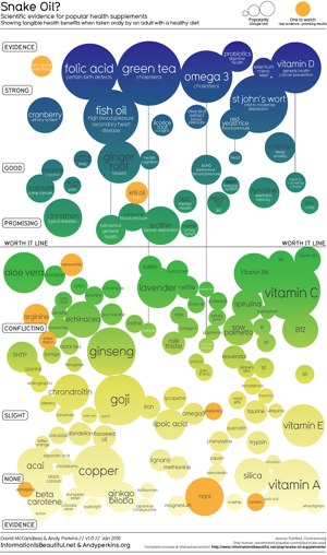
This is an intriguing interactive infographic developed by superstar David McCandless in the area of health. It represents various dietary supplements as balloons that rise or fall based on the evidence that they actually have positive effects on various and selectable ailments and conditions.

McCandless says,

This image is a “balloon race”. The higher a bubble, the greater the evidence for its effectiveness. But the supplements are only effective for the conditions listed inside the bubble.

You might also see multiple bubbles for certain supps. These is because some supps affect a range of conditions, but the evidence quality varies from condition to condition. For example, there’s strong evidence that Green Tea is good for cholesterol levels. But evidence for its anti-cancer effects is conflicting. In these cases, we give a supp another bubble.

The backend data is stored and the graphic is generated out of this Google Doc. From here, new research can be added in, adapting the graphic. Source documents are included in this file.

Links:

Solar System Scope

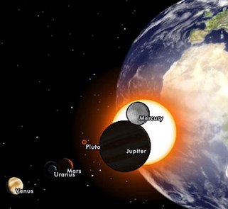
Not all infographics can be printed on paper. Some can move and some are interactive, like this project, brought to my attention by Andrew Vande Moere’s in Information Aesthetics. You have a 3D map of the Solar System, that you can flick around, and even zoom in on planets and other astronomical objects.

From the article,

Solar System Scope [solarsystemscope.com] offers an intuitive 3D interactive view of our solar system.

While the application is able to show the real-time celestial positions of planets and constellations moving about in heliocentric, geocentric and panoramic views, it also allows the changing of various parameters, inclusive of time, and the measuring of distances between planets.

Blog Article: Solar System Scope: a 3D Interactive View of our Solar System

Main Site: Solar System Scope

Are We Wasting Children?

Adapted from Nightmare II, posted on Flickr (cc) by Hammer of Dawn

I had a nightmare last night. It doesn’t happen very often, and when it does, it’s usually about being insufficiently dressed, some weird misbehavior of gravity, or a spooky inescapable house in the middle of a field.

This one was different. It started on television, an intro to one of those TV News exposes. The reporter earnestly recites four names, with their school pictures lined up on the screen overlaying a sepia’d image, the aftermath of a grizzly gun battle. He continues, “..killed in a gang shootout — during school hours.”

The reporter describes evidence indicating that none of the four boys were gang members, that the killings were the consequence of simply being in the wrong place, at the wrong time. “So,” He says, “Who was responsible for these four senseless deaths?”

“Was it their schools?”

The report goes on to explain how the four youngsters, and many more like them, had fallen through the cracks of a school that was judged by the performance of its enrolled students, and that some students had become more valuable to the school, when dropped from their rosters.

It was a dream — a very bad dream. I have never encountered an educator, school, or school district that I could believe for an instant might be capable of encouraging students to drop out. But I do know, first hand, of youngsters who were so frustrated by the regimented nature of their classrooms that they dropped out, at seemingly little resistance from their schools. Though they were each diagnosed with learning disabilities (A.D.D. & A.D.H.D), these were all bright, talented, middle class kids, with college educated parents, and MUCH more to offer society than the ability to conform to a standards-based education regime.

But the catalyst of this bad dream, I think, was a conversation I had with an educator a couple of weeks ago. I do not remember if he was a principal or working on an education administration degree, but he told me about a course he was taking on data driven decision making. He said that they were leaning how to analyze student performance data in such a way as to identify those students, or demographics of students, who, with attention, could statistically improve the school’s scoring, and, consequently, the students who would be a waste of scarce resources, from the viewpoint of the school’s standing.

Essentially, he was learning how to “game the system,”

Are we gaming the system at the expense of children?  Is this really happening? Is this what public education in this country has become?

Are we wasting our children?


– Posted using BlogPress from my iPad


The State of Twitter

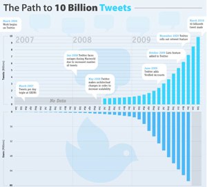
Are you on Twitter? After viewing this infographic, you might ask, “Why not?” From the Mashable blog post I got this from,

There is no doubt that Twitter has been a runaway success. Add to their rapid growth the recently announced @anywhere platform, and plans for further international expansion, and it comes as no surprise that the company is not looking to sell — at least within the next 2 years.

While the site’s growth has certainly been impressive and it has reached the point of non-displacement, there are some interesting hidden truths about Twitter and its users. The following graphic takes a look at Twitter’s path to 10 billion tweets, what we have learned about its users and what they’ve been talking about along the way.

Blog Link: The Current State of Twitter

Graphic Link: The Path to 10 Billion

Data Sources: HubSpot, Mashable, Pingdom, RJMetrics, Twitter, Quantcast

UNESCO Institute for Statistics – ..education data from around the world

Beyond_20_20_WDS_-_Table_View-20110405-131917.jpg
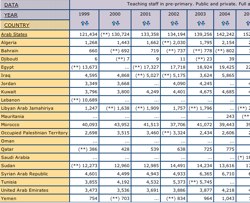
This is a broad set of data describing education around the world. Example of tables include:
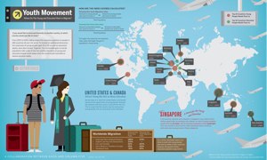
  • Demographic and economic data
  • Enrollment by grade
  • Repeaters by grade
  • Teaching Staff
  • School Life Expectancy

..and much more.

There is a somewhat difficult to decode method for customizing your tables, but I was able to produce and download an Excel file with the number of educaiton staff in the Arabe nations from 1999 to 2010 in about 15 minutes.

So what you you do with that?

Youth Movement

The world may never have been so mobile, and the shifting demographics will certainly affect the future of various parts of the world. So where are the young moving and how much skill and knowledge (education) are they carrying with them? This collaboration between GOOD and Column Five Media seeks to answer these questions.

From the blog entry:

From 2007 to 2010, Gallup posed this evocative question to people in 148 countries all over the world. To include an additional dimension, the responses of young people aged 15 to 29, as well as educated adults, were also tracked. Together, the conceivable gain in overall population tell a tale of how the wishful relocation of young and educated people could shape what the world would resemble as desire becomes reality.

Instructional Ideas:

Learners might be asked to investigate countries, to which educated youth are moving, suggest, and support what they think might be the conditions and opportunities that draw them.

Data Source:

Gallup

Radiation Dose Chart

There is a lot of discussion these days about radiation links from the damaged nuclear reactors in Japan. Unfortunately, there is little mention of the amount of radiation and it’s danger. This infographic was shared by Randall Monroe through his XKCD blog.

From the Source:

Ellen, a friend of mine who’s a student at Reed and Senior Reactor Operator at the Reed Research Reactor, has been spending the last few days answering questions about radiation dosage virtually nonstop (I’ve actually seen her interrupt them with “brb, reactor”). She suggested a chart might help put different amounts of radiation into perspective, and so with her help, I put one together. She also made one of her own; it has fewer colors, but contains more information about what radiation exposure consists of and how it affects the body.

Note that there are different types of ionizing radiation; the “sievert” unit quantifies the degree to which each type (gamma rays, alpha particles, etc) affects the body. You can learn more from my sources list. If you’re looking for expert updates on the nuclear situation, try the MIT NSE Hub. Ellen’s page on radiation is here.

Instructional Suggestions:

This infographic will certainly provoke conversations about radiation, various radiation related health diagnoses and treatment.  There are also opportunities to integrate mathematics, asking learners to compute proportions.

Data Source(s):

List of source links