Tricks of Photography & Teaching

Brenda (my wife) and I are having a continuing “conversation” about photography.  She’s a purist, a once passionate photographer in the age of film.  Like many things, she set aside her passion for picture-taking for motherhood.  Yet, she continues to have an opinion about what’s good photography and what’s…

Bottom line, digital processing of photos is not photography.  She wants the photos to look like photos and the other stuff can be enjoyed by people who enjoy.. well, “other stuff.”

I’ve been trying to figure out how to explain to her the joy I have playing with the photos that I take, using a variety of computer applications, to continue to make the picture – and I think I’ve found an angle.

It started a while back when I was watching a photography podcast, a session about HDR (High Dynamic Range) (see this previous article). The speaker said that,

“HDR enables the photographer to capture what it was that inspired the taking of the picture.”

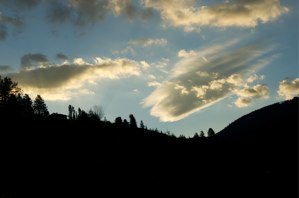
The more I thought about it, the more sense this statement made.  You see, when I look up this mountain, the house, and the distinct cloud formations above it, I’m struck by both the distance and the closeness, the sheer quantity of ground, covered by giant spruce trees standing before me and the changing hues that all seem eager to claim their place, I am overwhelmed by the awesomeness of it – and I aim and snap.

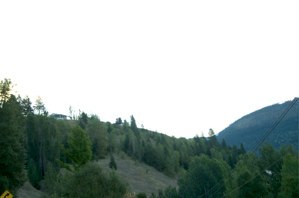
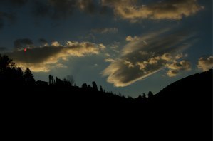
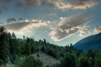
The original photo, where the brightness of the sky and clouds darkens the mountain-scape

Two more exposures, an over exposure (light) and an underexposure (dark)

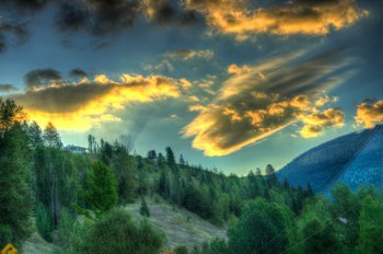
The software combines the three photos, and enables me to bring through the qualities of each that recapture what it was that inspired me to snap the photo.

I can even push some of the qualities beyond their reality to make a picture even more interesting, and perhaps more inspiring.

But, when I finally display the photo on my computer screen, it comes out pretty much as it was, though not as I saw it. My mind, you see, saw more than my eyes did.  It saw the multiple distances, the sunlight swimming through millions of spruce needles, the warmth in the clouds and coolness in the mountains’ shadows.  My mind amplified the vibrant colors and registered that the scene was only part of a 360º panorama of sameness and diversity.  

My brain made the vision something that no camera could adequately capture, both functionally and technically.

But, when I take three different photos of the scene, at three different exposures, and load them all into my HDR software (Photomatix), I can bring out specific qualities of each exposure, overlap them, bleed them through and accentuate, approaching the vibrance and space that inspired me to aim and snap.  I can also exaggerate qualities creating a surreal version of the image, perhaps making interesting something that simply wasn’t to start with.

Now, there’s a reason why I tell this story here.  I use to have a bulletin board in my classroom that read, “This classroom is a lens through which you can see the rest of the world,” and I meant it.  But there was only so much of the world that I could show my students through 5+ year old textbooks, a 1948 world map, and three cracked chalk boards.  To be sure, there was not a lot more I could have done with more recent textbooks, a brand new map and shiny new white boards.  The purist would say that I was doing my job, and perhaps doing it well.  I was playing my role – educating my students and teaching them skills.

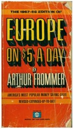
It was also during those first years of teaching that I started paying attention: to the news, to people who weren’t students or teachers, to science (became fascinated by quantum physics), to geography (we owned the book, Europe on $10 a Day (now Europe on $85 a Day) and dreamed of summers, vagabonding across the old continent).  I came to realize just how exciting and mysterious and vibrant the world really was, and was inspired to become a better teacher and better lens for my students.  

Closest that I could come. It’s so hard to find pictures of things that predate the World Wide Web.

But, I couldn’t do it.  I went back to the classroom, continuing my traditional role as teacher, expecting my students to sit still, pay attention, and remember.  My passion as a lecturer wasn’t nearly enough.

Here we are today, with a new kind of classroom.  Our personal learning devices give us access to networked, digital and overwhelmingly abundant information.  We are no longer teaching from information scarcity.

Are we now teaching in a time when we can HDR our classrooms.  Might we finally capture and share what it was about our world experience, that inspired us to teach.  Might we even exaggerate hues and contrasts and blend colors in weird ways.  Can we make knowledge flow and glow and grow and cause learning to energize our children – rather than steal it from them.

Can we push reality into our classrooms and inspire our learners to become members, participants, and shapers of their future? – and ours?


From the Cave to the Kitchen

In hundreds of thousands of years, and seven steps, man has gone from discovering fire for cooking, to having ovens in nearly every home. We began with log fires and rotisseries over the flame, developed stone ovens, moved these ovens into buildings, and then into our homes. What else is in the kitchen? How has […]

In hundreds of thousands of years, and seven steps, man has gone from discovering fire for cooking, to having ovens in nearly every home. We began with log fires and rotisseries over the flame, developed stone ovens, moved these ovens into buildings, and then into our homes.

What else is in the kitchen? How has the kitchen, as a building, evolved? What had to occur for the kitchen to be brought into the home? What about plumbing, the stove top, and the refrigerator. Can your students create simplified timelines outlining these kitchen innovations?

Blog: http://visual.ly/cave-kitchen-history-oven?view=true

Premium Telescope Technology

Here’s a neat video that shows of the functionality of a Large Binocular Telescope. It uses twin sets of multiple mirrors that bounce images back and forth until they have a clear picture of what they’re looking at. This really seems to …

Premium Telescope Technology

Here’s a neat video that shows of the functionality of a Large Binocular Telescope. It uses twin sets of multiple mirrors that bounce images back and forth until they have a clear picture of what they’re looking at. This really seems to be the next step in telescope technology.

Embed This Video

London Vs. Paris

Not only does this infographic, originally posted by the great dailyinfographic.com blog, sheds light on a centuries long rivalry between to major countries, it also shows a great way to compare two different like objects, or in this case cities (don’t tell them I said they are alike though). The rivalry, property disputes, and wars […]

Not only does this infographic, originally posted by the great dailyinfographic.com blog, sheds light on a centuries long rivalry between to major countries, it also shows a great way to compare two different like objects, or in this case cities (don’t tell them I said they are alike though). The rivalry, property disputes, and wars have gone back and forth since the beginning of each country. Political peace between the two nations has only occurred during the last century, the extent of much of our memories. But as this infographic points out, politics is the extent of this peace.

Food is a great topic of debate between the two nations. Citizens of each country is say that the other doesn’t know how to cook. This is a matter of palette. In addition, each have monuments, cathedrals, and beautiful buildings around every turn, both classic and modern. And a variety of entertainment in each city.

But what this infographic also does is show a great way to compare two like objects, or places. When each a topic between each is compared, an example is given. The size of the cities is spacially compared, the monuments and skylines are compares, and the variety of restaurants and the price of a meal is compared. But the important thing is that these are compared side by side, with the Eiffel tower right beside the London Eye.

When creating such an infographic, make sure the reader does not have to search for a comparison, but can see the two side by side.

Blog: http://dailyinfographic.com/london-vs-paris-infographic

Credit: This infographic is the work of a creative team with HouseTrip London

Fermi at Five Years

Fermi is a space observatory launched by NASA in June 2008 that has been used since then to observe happenings in all reaches of space. It is loaded with instruments, most importantly a telescope and a Gamma-ray Burst Monitor and with these instruments NASA has been able to make many discoveries over the past five […]

Fermi at Five Years

Fermi is a space observatory launched by NASA in June 2008 that has been used since then to observe happenings in all reaches of space. It is loaded with instruments, most importantly a telescope and a Gamma-ray Burst Monitor and with these instruments NASA has been able to make many discoveries over the past five years. This video outlines several of these discoveries that have taken place at varying distances from Earth.

Embed This Video

The Fight for Democracy in the Middle East

As I imagine it, using this infographic would require students who are a little more advanced and knowledgable about current events. This is an interact timeline on the fight for democracy in the Middle East, and includes several countries. However, it only covers mid December 2010 through the beginning of February 2011. Many things have […]

As I imagine it, using this infographic would require students who are a little more advanced and knowledgable about current events. This is an interact timeline on the fight for democracy in the Middle East, and includes several countries. However, it only covers mid December 2010 through the beginning of February 2011. Many things have happened since the dates this infographic covers.

Have the students study this infographic, and maybe even do extra research on the events. Possibly give them a few days to do research on what has happened since this infographic. My goal would be to have students understand cause and effect, and how effects can be further causes. At the end of 2010 and beginning of 2011, these were events that had been started by other events, basically the fight for democracy in this region. However, these events, we now know, have led to other events. What other events have occurred directly because of these events on the timeline? What could be going on now had things happened differently?

Blog: http://goo.gl/k8muq9

Latest SpaceX Grasshopper Test

Here we see the latest test by the people at SpaceX on their re-usable rocket, Grasshopper. The cancellation of the Space Shuttle program was certainly sad, but it is encouraging to see companies like SpaceX essentially picking up where NASA left off. I’m envisioning these test videos being played in the SpaceX museum 20 years […]

Latest SpaceX Grasshopper Test

Here we see the latest test by the people at SpaceX on their re-usable rocket, Grasshopper. The cancellation of the Space Shuttle program was certainly sad, but it is encouraging to see companies like SpaceX essentially picking up where NASA left off. I’m envisioning these test videos being played in the SpaceX museum 20 years from now, how about you?

Embed This Video

Moon Phases Explained (with Oreo cookies)

This infographic includes a great activity for students of any age. Hand out Oreos to each student, and have them create each moon phase as depicted at the top of the infographic, assigning one phase per student. Then create a sun (a lamp), facing the Earth, and have students place themselves at each phase, as […]

This infographic includes a great activity for students of any age. Hand out Oreos to each student, and have them create each moon phase as depicted at the top of the infographic, assigning one phase per student. Then create a sun (a lamp), facing the Earth, and have students place themselves at each phase, as they believe theirs lays between the Earth and sun (as explained at the bottom of the diagram). Have students think about why they believe they belong where they belong, and ask a few to explain.

Then have students return to their seats and show them this infographic, and ask how many students were correct. For some people, the relationship between the sun, Earth, and moon are very advanced, it involves a higher level of think. It involves thinking about where the shadow would be on the moon, where the light would be on the moon, and how this affects how we, on Earth, see the moon.

After your students sit down, have the students study this infographic and try to understand exactly what happens. The moon phase names don’t matter (except for the test if you wish), but rather what happens to the moon as far as what we see, as it orbits Earth. Also, one important point, is that we don’t orbit the sun on the same plane the moon orbits us, which is why we see a full moon when the moon is on the opposite side of the sun as Earth.

Blog: http://visual.ly/moon-phases-explained-oreos

The Man who made and Island

Meet Richart Sowa, visionary. At face value he could be the craziest character on a sit-com, but it turns out there’s a great method to his alternative lifestyle. He decided he could make an island out of normally disposed-of materials, and he actually pulled it off. Not only does he have a floating piece of […]

The Man who made and Island

Meet Richart Sowa, visionary. At face value he could be the craziest character on a sit-com, but it turns out there’s a great method to his alternative lifestyle. He decided he could make an island out of normally disposed-of materials, and he actually pulled it off. Not only does he have a floating piece of “land”, but a very suitable home on top of it.

Now I’m no engineer or ocean scientist, but this seems pretty solid to me. Obviously the biggest immediate danger would be major weather events, but perhaps in places where those are less likely to happen, we might see some more of these cropping up. This guy may be a true pioneer.

Embed This Video

Best State That Money Can Buy

Scaling down the travel part of my work has provided me with weeks at home instead of days or hours. This leaves me with time to play/learn more about some tools I’ve only been tinkering with in the past. In addition to that, it’s given me time to pay more attention to some topics that I’ve ignored for way to long – politics. I’ve especially become interested in the politics of my state, North Carolina, as has much of the rest of the country and parts of the world. I’ve already written a bit about it here (Will Public Education in North Carolina Rest In Peace?) and here (In Defense of Liberal Arts – Sort’a).

Click here to download the large PDF version.  The spreadsheet can be seen here.

As many of you know, my daughter has been contributing semi-regular blog posts here, featuring selected infographics and some data visualizations.  It’s of particular interest to me and one of the few topics I continue to present on in conferences – and with the benefit of time, I’m learning more about working with vector graphics.  

Making an infographic is fairly easy.  Making one that effectively conveys a message is hard.  As an IT guy at a local CityCamp said, “Don’t try this on your own.”  Well that’s the kind of challenge that inspires me, not to mention the message that our state has been hijacked by corporate concerns, masquerading as social knee-jerk issues.

For this project I dug into the North Carolina election results for 2012, the year that it happened.  I created a spreadsheet that tied the election results (North Carolina Board State of Elections) in with the costs of the campaigns (Follow the Money) for our governor and General Assembly elections.  It revealed some pretty interesting facts about who elected who, how much it cost and who paid for it.  See full size infographic here.

Of note:

  • All fifty seats of the North Carolina Senate were up for election. Democratic candidates received 1,854,358 or 47.22% of the votes cast. Republicans received 2,072,984 or 52.78% of the votes cast. Yet, Democrats won only 17 seats compared to 33 seats to Republicans. I’d like to know what math we teach in schools that reconciles that.
  • Even though Republicans won 76 seats to only 42 seats going to the Democrats, 48% (1,842,541) of the state’s votes were cast blue while only 52% (1,998,155) cast red.  Again, an interesting Algebra project.
  • Democratic Senate campaigns spent $3,257,182 (25% of total spending) while Republican campaigns spent $9,602,925 (75% of total spending).  In the House, Democratic campaigns spent $6,021,281 (34% of total spending) compared to $11,762,624 (66% of total spending).  There seems to be a closer correlation between dollars and who governs than votes.  How did this happen?
  • What surprised me was the money spent on campaigns compared to the number of votes.  In the state Senate races, each vote cast for a Democratic candidate cost $1.76 in campaign spending.  Republicans spent $4.63 for each vote cast for their candidates.
  • For the House races, Democrats owe somebody $3.27 a vote while Republicans own somebody $5.89 per vote.
  • I’ve listed the top contributors to both parties, not including candidate and party committees.  These are organizations that contributed more than $100,000 dollars.  The red bar shows the portion going to Republican candidates and the blue indicates investments in Democrats.  As you can see, most contributed to both parties, though most gave most of their money to Republicans.
  • Looking at specific campaigns, it was a shock to me how much money some of our democratically elected representatives paid for their campaigns.  Pat McCrory paid $5.00 ($12,202,756) for each of his 2,440,707 votes.  Walter Dalton, the Democratic candidate paid $2.09 ($4,044,750) for each of his 1,931,580 votes.
  • The obscenity is in some of the General Assembly campaigns.  Thomas Tillis (Rep), the Speaker of the House, paid $59,15 for each of his 27,971 votes. Phil Berger (Rep), the Senate’s president pro tem, paid $38.59 for each of his 58,276 votes. Tim Moffitt (Rep) spent $23.61 for each of his 21,291 votes and John Szoka (Rep) paid $21.87 for each of his 16,208 votes. To be sure, the Republicans were not the only ones spending obscene amounts of money for their votes. William H. Battermann (Dem) spent $61.30 per vote, getting only 38% of the vote. Rick Glazier (Dem) won, spending $14.47 for each of his 17,266 votes. Jane Whilden (Dem) spent $13.84 per vote, trying to defeat Tim Moffitt (Rep).

My question is, “How are they earning that money?”

Downloads: Infographic (http://goo.gl/He1ICB) • Spreadsheet: (http://goo.gl/60MqZw)