Analysis of News Writers’ Biases

Part 1

I’ve been working on a project that, unfortunately, has gotten a bit out of control.  It happens when you’re old and you’re reminded that you are no longer as smart as you think you use to be. Life’s a ride.

My research question was something like, “Can I determine political bias in the web texts of news articles? 

MY BIAS

I entered this project with acknowledged biases.  It has been my opinion that some 24-hour news networks have become a leading cause of the toxic polarization that has infected our lives, thus my interest in the question.  It seems to me that their business plans depend on attracting viewers and readers, and keeping their attention.  This is not an uncommon strategy for web sites trying to maximize ad revenues.  

However, I believe that the news that we use to understand our world is sacred to a sustainable democratic society, and some news services have tried to do business  by exploiting some of our baser tendencies by spicing their commentary and analysis with controversy and conspiracy, dangerously corrupting the integrity of that news. 

METHOD

For the study, I  began by analyzed 15 stories from the home pages of three news providers, all captured on February 24, 2024 between 9:00 and 9:15 AM.

My subjects were:

  1. Fox News, whom I believe to be biased toward the right, conservative, Republican ideologies.
  2. MSNBC, whom I believe to be biased toward the left, liberal, Democratic ideologies.
  3. NPR, whom I believe to be mostly objective and neutral in its deliveries.

An Early Surprise: One of my first surprises was realizing, after initially scanning through the files, that there were articles on all three news web sites that I was anxious to finish reading, for the enjoyment of learning something new.  This knocked my socks off.

Next Reports:

I hope to illustrate some of the data that I’ve collected and a few personal insights in following posts. Topics will include the writers, the text, advertising & political sentiment.

I will also be accumulating it all here: 2¢ Worth [2cents.onlearnin.us]. 

Left, Right, Up & Down in U.S. Politics

I ran across an incredible web site today. As someone who is interested in politics, and especially its ongoing evolution, this really scratched an itch. It’s voteview.com and they record all rollcall votes cast by the U.S. Senate and House of Representatives, going back to the first congress of 1789-1791.

I was looking for data that I could visualize to indicate the degree to which Republicans and Democrats have crossed, implying times of compromise. But I found the following visualization on voteview.com that showed me exactly what I wanted to illustrate.

graphSm

I have marked the region between 1940, marking the beginning of the Roosevelt/Wallace administration and 1980, marking the beginning of the Reagan/Bush era. You notice a lot of crossover between Republicans and Democrats. The Liberal to Conservative scale was determined by the DW-NOMINATE or Dynamic Weighted NOMINAl Three-step Estimation.  I call that period “the good old days,” because it is the period of U.S. political history with which I identify and measure current conditions.

Another interesting application of DW-NOMINATE is the geography data.  You can enter your zip code and you see the ideology of your district’s representatives.  The positions of the red or blue bars are based on the NOMINATE index value of your representatives during that particular congress.  Below and left shows the ideologies of representatives from Raleigh, North Carolina going back to my graduation from high school.  The right shows the ideologies of representatives from Cherryville, my home town, going back to high school.  I just think this is cool!

GeoRaleigh GeoRaleigh

Lewis, Jeffrey B., Keith Poole, Howard Rosenthal, Adam Boche, Aaron Rudkin, and Luke Sonnet (2017). Voteview: Representing places through time. https://voteview.com/

Lewis, Jeffrey B., Keith Poole, Howard Rosenthal, Adam Boche, Aaron Rudkin, and Luke Sonnet (2017). Voteview: Parties Overview . https://voteview.com/

A Couple of Observations about the Election

“Playing with data is as fun as playing with Legos”

Even though I suspect that most Americans, Republican and Democrat, believe in mostly the same things.  The political gap seems to have much to do with your neighborhood – that is to say, how far you live from your neighbors.

I did a little figuring with the population density of each state and the percent of votes cast by its residents for Donald Trump.  The correlation coefficient (yes, I’m college educated) was -.46, which apparently is a moderate downhill or negative relationship (see chart #1). In other words, the higher the population density (urban) the less likely you and your neighbors were to vote for Trump. The lower the density (rural), the more likelihood of Trump votes in your neighborhood.

Chart #1
Chart #1

But this gap seems to have been magnified by the U.S. Constitution, as the document describes the Electoral College. North Dakota, 47th in density ranking, cast 216,133 votes for Trump. That amounted to only 72,044 votes for each of the state’s 3 electoral votes for the Republican candidate. In Massachusetts, the 3rd most densely populated state, it took over 100,000 more votes for Clinton (178,615) to earn one of the state’s 7 electoral votes for the Democrat (see chart #2).

Chart #2
Chart #2

What surprises and disturbs me is the education gap. The graph below, from Pew Research Center, indicates that among all voters, those with college degrees or more voted for Hillary Clinton by 9 points, while voters with some college or less chose Donald Trump by 8 points. The education gap widens when looking at white voters only, a gap of 35 points.1

There are many ways to read meaning into this, and I’m going to be thinking pretty hard about it. But we might assume that free college education, as provided in many European countries, is pretty much off the table here at home.

Education Gap
Education Gap

1  Tyson, A., & Maniam, S. (2016). Behind Trump’s victory: Divisions by race, gender, education. Retrieved from Pew Research Center website: http://www.pewresearch.org/fact-tank/2016/11/09/behind-trumps-victory-divisions-by-race-gender-education/

Who Would Teach for Cuckoos?

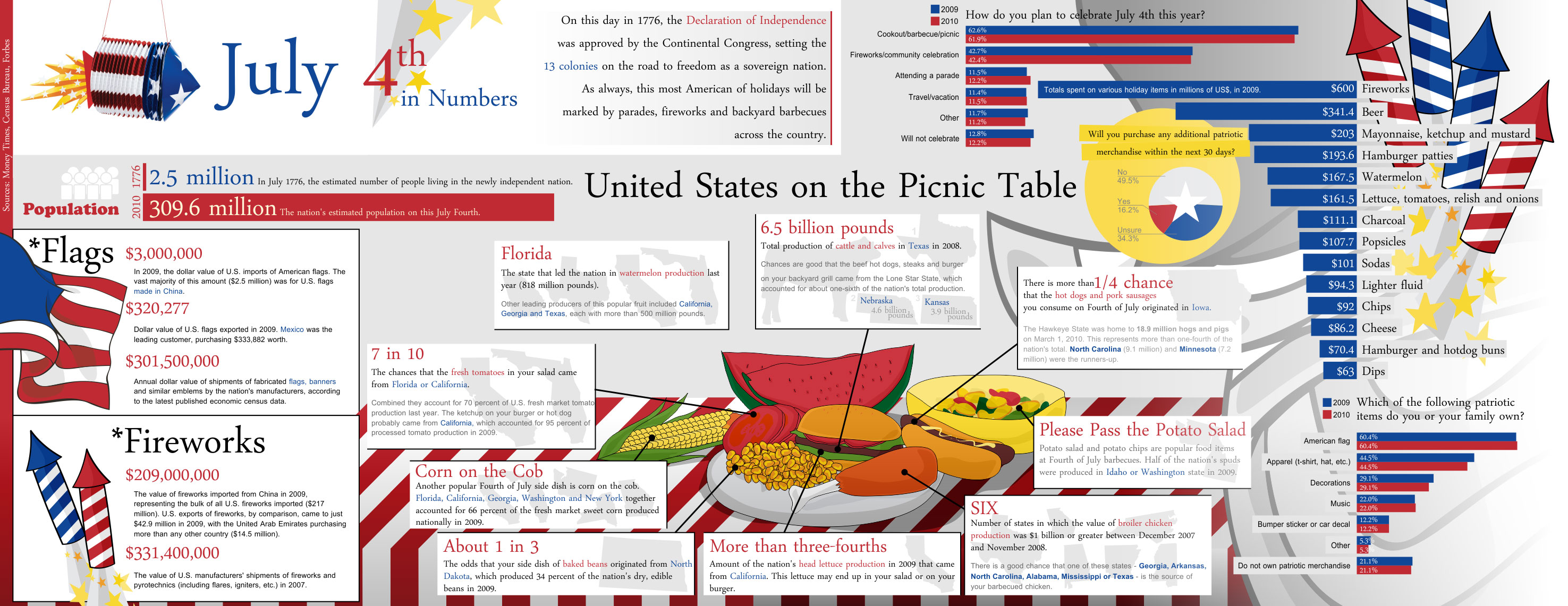
In the graphs below, I label the X-axis as “Years of Republican Led General Assembly,” referring to the years that North Carolina’s legislative branch has been dominated by the Republican Party, the first time since 1870.  I regret using this distinction because I actually respect much of what I think the Republican Party represents.  I am referring, instead, to the Cuckoo legislators, arrogantly conservative politicians who appear to be Republicans, holding just enough resemblance to push many fine and thoughtful statesmen out of the nest of North Carolina’s State Government.

The Exceptions

Spreadsheet ods  OpenOffice Calc

Why? click

That said, I want to report on one of the many effects of their arrogance, and not the millions of dollars lost to the state as a result of their hastily written and passed HB2.

I am no longer a teacher.  I left the classroom for leadership roles in a time when teachers practiced autonomy in their classrooms and were rewarded for advancing their own educations.  Today, I can barely imagine how demoralizing the last five years have been for North Carolina teachers, and for school administrators who are desperately struggling to fill their classrooms with qualified teachers.

The solution to an alarming teaching shortage is simple, at least to the amateurs in Raleigh.

Appear to grant a raise to teachers in North Carolina.  

Factoring in the nominal inflation of the past decade and a half, teacher pay in North Carolina has dropped 13%.1  Real and significant raises would certainly help and are certainly warranted.  But there’s nothing new here.  While teachers have always been grossly underpaid, we have continued to have talented and committed men and women wanting to become teachers.

In my opinion, the teacher shortage has more to do with the declining conditions of the job and the increasing barriers that stand in the way of real learning in the classroom.  A teacher’s passion comes from celebrating the meaningful learning and growth of her students.  But today, the creative art of teaching has been spoiled by requirements to comply with government mandated standards that are measured by tests that choke real learning.

..And why would a high school student want to do, what they’ve spent 13 years watched their teachers dispair in not being allowed to do?

The result?

Enrollment at the 15 UNC schools of education has plummeted 30 percent since 2010, a worry for a state where those programs are the biggest source of classroom teachers.2


Read more here: http://www.charlotteobserver.com/news/local/education/article58311793.html#storylin1

I recently received a document from one of the state’s 15 schools of education that lists the numbers of students joining their various education programs since 2012, and the numbers SHOULD worry us.

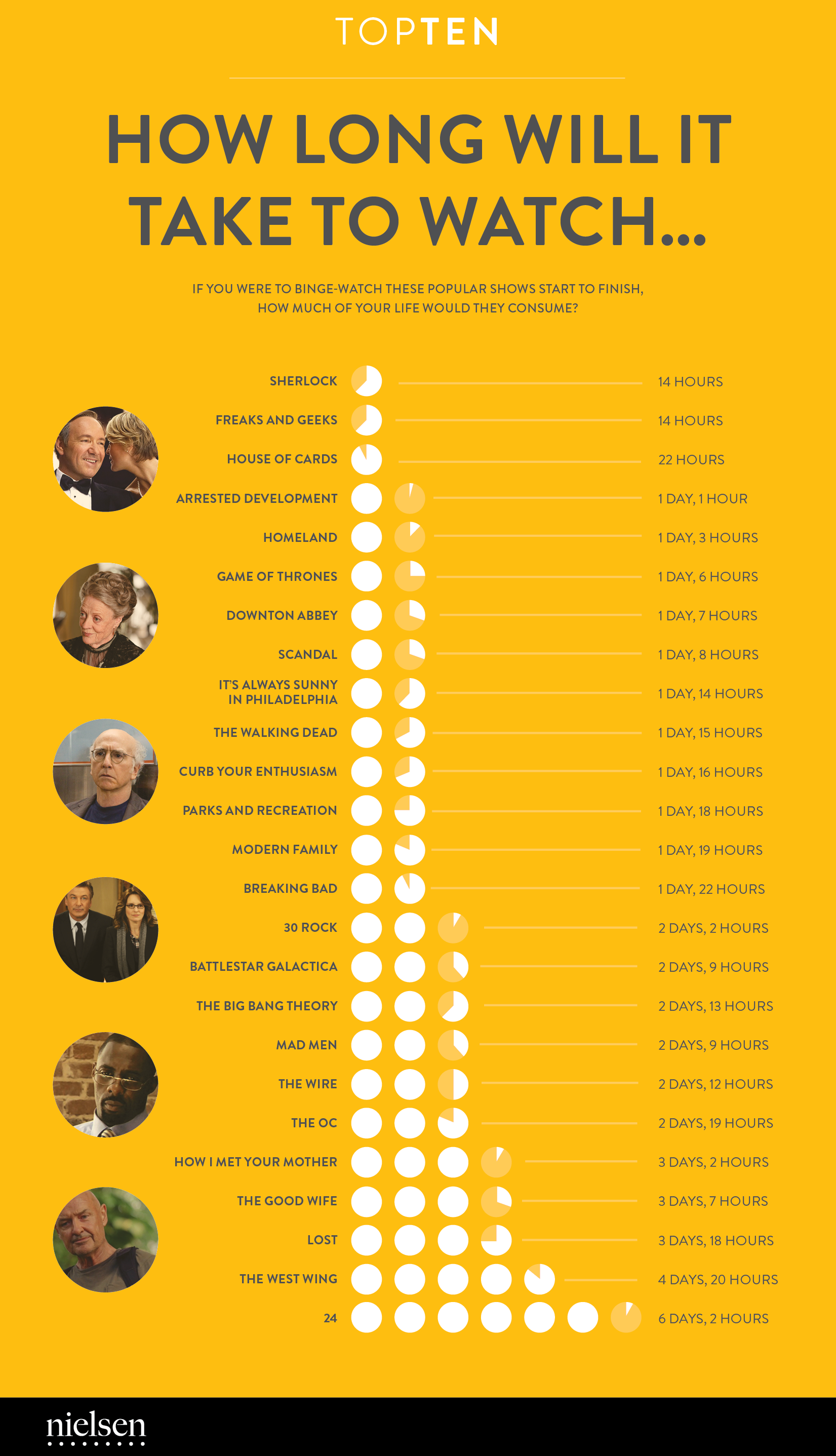
For instance, this graph illustrates the university students who are planning to become elementary school teachers.

Elementary Ed

The decline, since 2012, represents a net loss of 213 potential elementary school teachers.

Equally disturbing are the numbers entering Math and Science programs, illustrated here.

Science/Math Ed

That’s 34% few Math and Science teachers than would have been likely in a more stable environment.  And, as I’ve written many times before, the real problems of this state, nation and world have less to do with Math and Science, and more to do with our social condition – and we’ve lost 65% of the Social Studies teachers we might have had.  In 2016, no college student in that university sought to pursue a career as a Social Studies teacher.

Socialstudies

Considering how teachers have been treated in this state, it is easy to fathom what these Cuckoo legislators fear the most.  It is highly educated and organized teachers.  In many of the state’s communities, the most educated citizens are teachers.  It’s why the General Assembly and Pat McRory (Governor) stopped paying higher salaries to teachers with advanced education (part of the Appropriations Act of 2013).  We are the only state that does not pay more to teachers with graduate degrees.  The result?

MastersDegreePrograms

A loss of 27%, though many teachers continue to advance their own education, even without compensation.

If you are a North Carolina voter, and you believe that the future of our state depends on the talent and intelligence of its citizens, then learn how your representatives voted on the final adoption of the Appropriations Act of 2013. If you do not know who your representatives are, go here.  Then go here and click the name of your House member (here for your senator) to see their voting history in 2013-14 session.  If he or she voted “No” to the final adoption of SB 402, the Appropriations Act of 2013, then they voted FOR teachers and stronger public schools in North Carolina.


1 Hinchcliffe, K., & Johnson, C. (2016, April 26). After inflation, NC teacher pay has dropped 13% in past 15 years. WRAL.com [Raleigh].

2 Bonner, L. (2016, February 3). Enrollment plunges at UNC teacher prep programs. The Charlotte Observer[Charlotte].

What if it happened before the Internet?

One of the challenges of writing a history of educational technology is that so much of it happened before the Internet. I have been surprised and disappointed at how much of it, that I barely remember, has never been reported on the now ubiquitous World Wide Web.

As a result, I’ve had to be resourceful in my research, and one of the tools that I’ve found myself going to again and again is Google’s Ngram viewer.  Here’s the situation.  I’m writing about happenings just after I left the NC Department of Public Instruction and discovering that my future is going to be in training and presenting, instead of Web design and development.  I believe that it was during this time when the term “Integrate technology’ was being adopted by ed tech advocates.  But I’m not sure.  How do I determine, on a timeline, the growing use and abuse of the term.

Enter Ngram Viewer.  The default terms are Albert Einstein, Sherlock Holmes and Frankenstein.  The viewer presents a line chart, illustrating the number of Google digitized books that mention the term by year, from 1500 to 2008.  The default shows the gradual growth of Frankenstein from just after the publishing of Mary Shelley’s book (1818), and then a more rapid rise of Sherlock Holmes starting in the final years of the 19th century.  Occurrences of Albert Einstein started in the second quarter of the 20th century and then Frankenstein, again, overtakes and surges well above, starting in the 1960s – possibly as a result of television’s re-running of Frankenstein movies released in the 1930s and ‘40s.

Entering the term, “integrate technology into the classroom,” into Ngram Viewer, I learn that, although the term started to appear in the late 1980s, its popular use started to rise in the mid-1990s, as we left the growing number of education technology conferences with our new mantra, “Integrate Technology! Integrate Technology!  Integrate Technology!”

Ommmmmm!

Mom and Dad: How they Spend their Weekdays (1965 and 2011)

This is an interesting infographic showing the way the average American mom and dad spent their weekdays in 1965 and 2011. This is a great infographic to use as an example for how to create infographics. First, it’s a great example of a bar chart. This type of chart can be used as a comparison […]

image28This is an interesting infographic showing the way the average American mom and dad spent their weekdays in 1965 and 2011. This is a great infographic to use as an example for how to create infographics.

First, it’s a great example of a bar chart. This type of chart can be used as a comparison between any two of the same ideas. It also shows how to compare two like items. In this case, years of significance for moms and dads. The data may only be available as late as 2011, but why 1965, what events were occurring in 1965 that make this a good date to compare to 2011?

Blog: http://goo.gl/4u8Q1K

10 Years of iMusic

Technology changes with time. As one piece of technology becomes superior, another becomes inferior. This infographic portrays something interesting, iPod sales and iTunes songs purchased increased together until the mid and late 2000s, but by 2010, iPod sales were decreasing while iTunes sales continued to increase. What could have caused this? Discuss with your students […]

10-years-of-imusic_539f0c508dad0Technology changes with time. As one piece of technology becomes superior, another becomes inferior. This infographic portrays something interesting, iPod sales and iTunes songs purchased increased together until the mid and late 2000s, but by 2010, iPod sales were decreasing while iTunes sales continued to increase. What could have caused this?

Discuss with your students other things that occurred during this time. Could it be related to other technology, such as the iPhone that became increasingly available. There could also be the issue of the economic crisis, and people buying music just to listen on computers.

What other technology has affected the sales of other items. For instance, the record player and the record, the 8track player and the 8track, the tape player and the tape, and so on. Did any of these follow any similar trends. What could be the next technology that makes the iPod obsolete?

Blog: http://visual.ly/10-years-imusic

8 Great Things to do in London

Traveling is a lot of fun. Especially when one travels to another country or even just to another part of America, one is able to learn about another culture and different people. London may be one of the best cities in which to learn about a variety of cultures. One thing that threw me off […]

Traveling is a lot of fun. Especially when one travels to another country or even just to another part of America, one is able to learn about another culture and different people. London may be one of the best cities in which to learn about a variety of cultures. One thing that threw me off when I visited was the small amount of British culture to be seen in London. But one could walk down nearly any street in the city and see someone from almost every country, many of whom may reside in London. And fortunately for those interested in seeing British culture, trains are easy to navigate to cities in the country, each has something different to offer, and the country is rather small in size, compared to the US, and so going from one end to the other doesn’t take nearly as much time as one would expect.

If you were to visit a new city, it is important to make a list of what you want to see. Look on travel sites, and one of my favorites is to search the city on Pinterest. What are your interests. Especially in large cities, it would be difficult to see everything in even several days, so plan accordingly. Also, create a budget and do research. Most tourist attraction are expensive, but some are free. Transportation is also expensive in the city, and I know in London the taxi rates increase during certain hours. Look into mass transit and even walking.

Blog: http://visual.ly/8-great-things-do-london

America’s Birthday by the Numbers

Every year Americans celebrates their independence in a variety of ways, as this infographic shows. My family used to go to join my mom’s family by a lake for a picnic and then watch fireworks across the lake. My cousins would go early in the morning to get a spot right on the lake. I […]

americas-birthday-by-the-numbers_502915e2e9c9cEvery year Americans celebrates their independence in a variety of ways, as this infographic shows. My family used to go to join my mom’s family by a lake for a picnic and then watch fireworks across the lake. My cousins would go early in the morning to get a spot right on the lake. I remember seeing people putting watermelons in the water to keep them cool for later. We would usually bring in food from home or a fast food restaurant. There would be bands and lots of celebrations.

According to this infographic, this is a typical experience for most Americans. Most Americans cook out, although I know many who do it in their backyard, watch fireworks, and/or go see a parade. What do you suppose is the reason behind most of these celebrations. Fireworks are most likely related to the remembrance of war and bombs, cooking out may be related to older cooking habits, or simply the fact that cooking out is common in America in the summer. Parades were often used to increase moral during war times, and a way to say a last goodbye to soldiers shipping out or a first hello to soldiers coming home.

How do your students families celebrate? Do you have any students who are not US citizens or were born elsewhere? What was their first impression of these festivities? Most countries have patriotic holidays, what do they entail?

Blog: http://visual.ly/americas-birthday-numbers

How Long Will It Take to Watch

Sadly, binge watching television shows has become the pastime where binge reading once was. However, this is an interesting portrayal of information. Beginning with Sherlock and going down to 24, this infographic shares how long it would take to watch a series of popular tv shows without a break (although hopefully in that time you […]

how-long-will-it-take-to-watch_5362b20ca13faSadly, binge watching television shows has become the pastime where binge reading once was. However, this is an interesting portrayal of information. Beginning with Sherlock and going down to 24, this infographic shares how long it would take to watch a series of popular tv shows without a break (although hopefully in that time you do eat and shower).

But it does give a simple portrayal of time. Each circle stands for a day, each shaded portion stands for that portion of a day. So two fully shaded circles and one half shaded circle signifies two and a half days. How else can this time frame be used: the amount of time people of different ages use the internet, use their cell phones, and for what? How else could this shaded portrayal be used? As people, or as other objects significant to the infographic?

Blog: http://visual.ly/how-long-will-it-take-watch