 I’ve been fascinated by infographics and data visualization for a few years now and have started doing some presenting on the topic at conferences. But one of the questions that keeps arising and perhaps the greatest barrier to making stories with numbers and images is, “How do you do the design?” The tech is easy. It’s crafting the story or message that’s hard.
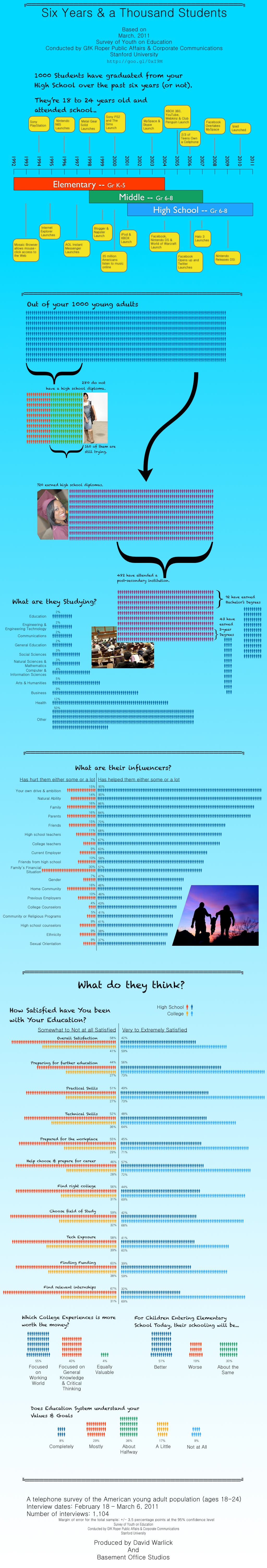
So I decided to try making one myself, hoping that some reasonable process might come out of it. I’m somewhat pleased with the graphic, as a first time effort, but can’t say that I have any handle on a design process. All I can say is that it involves a lot of trashing the whole thing and starting all over again. I guess its about a willingness to play and permission to make mistakes and do it again differently.
You can click the smaller image to the right to get the full 1024 x 6000 pixel infographic. The graphic is based on a March 2011 study conducted by GfK Roper Public Affairs & Corporate Communications and Stanford University. They surveyed just over 1,100 18 to 24 year olds about their education experience.
This also seems like a good time to finally mention a new blog I’ve been working on where I plan to post infographics that have interested me. My plan is to post a link to one a day on Monday, Tuesday, and Wednesday, something that I suspect might be used within some instructional discipline — and then a data source for creating infographics on Thursday, and something for the fun of it on Friday. This who excercize has informed me of the vast quantity of infographics that are being produced today — not all of it good.
So give a gander at an Infographic-a-Day at http://graphicaday.idave.us/.
Hope to have another one coming out in the next little bit to feature a video a day, which will be curated by my son.
It’s really a nice and helpful piece of info. I’m glad that you shared this helpful information with us. Please keep us informed like this. Thanks for sharing.
An infographic usually uses the info to convey a point, I cannot figure out what you want me to deduce by all of this information. Most importantly I don’t see what the top half has to do with the bottom half at all. Hope this feedback helps you make better infographs.
Since you are looking at data, this is an interesting site that might help you with some visuals.
http://neoformix.com/Projects/portfolio/index.html
Thanks a bunch. I actually haven’t seen a number of these. Look for this in my IGAD blog… http://davidwarlick.com/graphicaday/