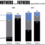
 This is an interesting infographic showing the way the average American mom and dad spent their weekdays in 1965 and 2011. This is a great infographic to use as an example for how to create infographics.
First, it’s a great example of a bar chart. This type of chart can be used as a comparison between any two of the same ideas. It also shows how to compare two like items. In this case, years of significance for moms and dads. The data may only be available as late as 2011, but why 1965, what events were occurring in 1965 that make this a good date to compare to 2011?
Blog: http://goo.gl/4u8Q1K

I wonder what men and women would have thought, in 1965, if they’d been shown this infographic then. Surprise? Denial? 😉