Warning: This post rates pretty high on the geek index.
 I started to blog about this a few weeks ago, when I first ran across it. But realizing that I am probably the only person I know who would get excited about something like this, I decided to put it aside. However, after spend a few hours this morning playing around with Google’s Chart API, I simply can’t resist.
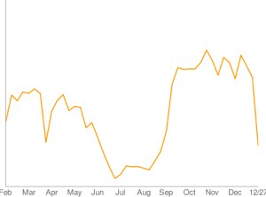
It’s a tool, of sorts, that allows you to generate graphs based on your own data. It’s a little geekie to work with, but very cool and perhaps a little useful. To the right is a graph, generated by Google’s Chart API, that illustrates the number of blogs posted to Class Blogmeister by the week over the past 12 months. The data comes directly from the site’s database, so it is dynamic. But it is possible to generate basic (and complex) graphs simply by adding values into a URL.
Here’s how it works:
The graph is driven by a URL. As an example:
http://chart.apis.google.com/chart?chs=200x125&chd=t:80,22,97,68&cht=lc&chl=Mar|Apr|May|Jun
This URL is made up of the following arguments:
chs — dimensions in pixels (200×125 means 200 by 125 pixels in size)
chd=t: — data to be charted (the “t:” indicates numeric data, 30, 22, 97,68)
cht — is the type of chart (lc mean line chart)
chl — lists the chart labels, which align with the chart data.
http://chart.apis.google.com/chart?chs=200x125&chd=t:80,22,97,68&cht=lc&chl=Mar|Apr|May|Jun
Copy the URL above and then pasted in the address box of a seperate browser window. Then change the numbers after chd=t: and refresh. Change the lc after cht to p3 and refresh. This will generate a three dimensional pie chart.
If you want to embed the chart in your own web page, then simply use the URL as the source for an image. The code would run like this:
You can go into more detail by going to the developer’s guide.
And the problem with being “high on the geek index” is ?
This is quite cool!
Jeff