I’ve been saying to myself for weeks that ISTE 2011 needs an app. I wrote them and told them that the ISTE conference needs an app. They wrote back and said, “Working on it.” Couple of weeks ago I found the ISTE Mobile app, which, as a conference support tool is pretty pathetic, though, as an association reference tool, it’s a pretty good start.
 This afternoon, however, with a couple of hours in my office after flying in from Omaha and getting on the train for Philly in the morning, I did a search on AppShopper, and there it was, posted 17 hours ago, ISTE 2011 Onsite Mobile… (I’m guessing the dot dot dot extends to “App”).
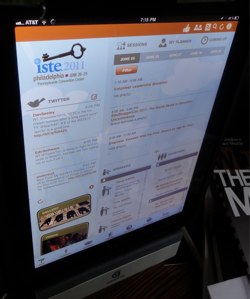
I haven’t looked at the iPhone version yet, but the iPad app is pretty awesome at first glance. It’s essentially a web page with all of the sliding windows that we’re accustomed to on our touch devices. Starting with the upper left corner is a Twitter roll, featuring a post from techfish21, 6:08 PM (currently 6:36). It only appears to display the latest feed’able 15 posts, which is a bit less than overwhelmingly useful. But we have other great ways to follow the conference buzz.
To the right is a calendar of events, divided by day, with a popout for each touched event. I am very impressed that it attaches to my planner. Even though I’d rather do my planning with a full screen web site, I know that there will be times when I need something to go see right now, and this will come in quite handy. I’d like it better if I could select a particular session block and see only presentations/workshops for that block of time. There is an icon to the right, “Coming Up,” that doesn’t seem to function yet. I wonder…
 Directly beneath is a slide’able alphabetical listing of presenters and exhibitors with popout details. The exhibitor details can click out into a map of the vendor hall. Now that could be handy.
In the lower left are icons for “Gallery,” still empty, and “Videos,” broken down by day. Upper right menu bar features a thumbs up, to review the App on the iTunes App Store; two friends, which clicks out into an email message announcing the app that you can address to family and friends; a magnifying glass for searching;and the reload icon to get the latest content. There’s also an (i) for information icon with info on the company who made the app, quickmobile.
On the bottom menu bar, and here’s where it gets interesting, is a maps icon. Touch it to get a floor plan of the exhibit hall, linked to details about the company. This seems less practical than it could be, because there are no titles in the map, so you’re clicking a booth number to see who’s at that booth. Maybe I’m just not thinking ahead enough.
Further down the list are maps of the various levels of the Pennsylvania Convention Center, labeling lecture and session rooms, playgrounds, and lounges, posters sessions, etc. I’d like it if I could swipe through to the various levels, rather than having to back out to the menu. Also, I found that the maps loaded rather slowly. Perhaps that’s a first time thing.
Other icons are:
- FaceBook – takes us to the ISTE FB page,
- Sponsors – obvious,
- Overview – at a glance schedule,
- Info Booth – further links to helpful references, including a glossary (Bloggers Cafe: A lounge featuring participatory blogging events and ISTE Unplugged)
- ISTE Connect – linking out to the Iste Connect web site,
- About ISTE
- The NING
Overall, I think that this is a great beginning, and a tool that attempts and succeeds to an impressive degree, to create a one stop resource to cover conference attending functions that we’ll all be relying on a dizzying array of individual apps and web pages to work.
Opps, the dot dot dot extends to Guide, not App.

David, I like the app on my iPad too, but I found too little space devoted to the sessions, and wished for a chance to filter by a specific time, so I could easily see everything that’s available at 10:00 a.m., say, or sort by area of the PACC as it’s so big.
Not to snark too much – it’s a terrific first effort that I’m sure will improve next year.